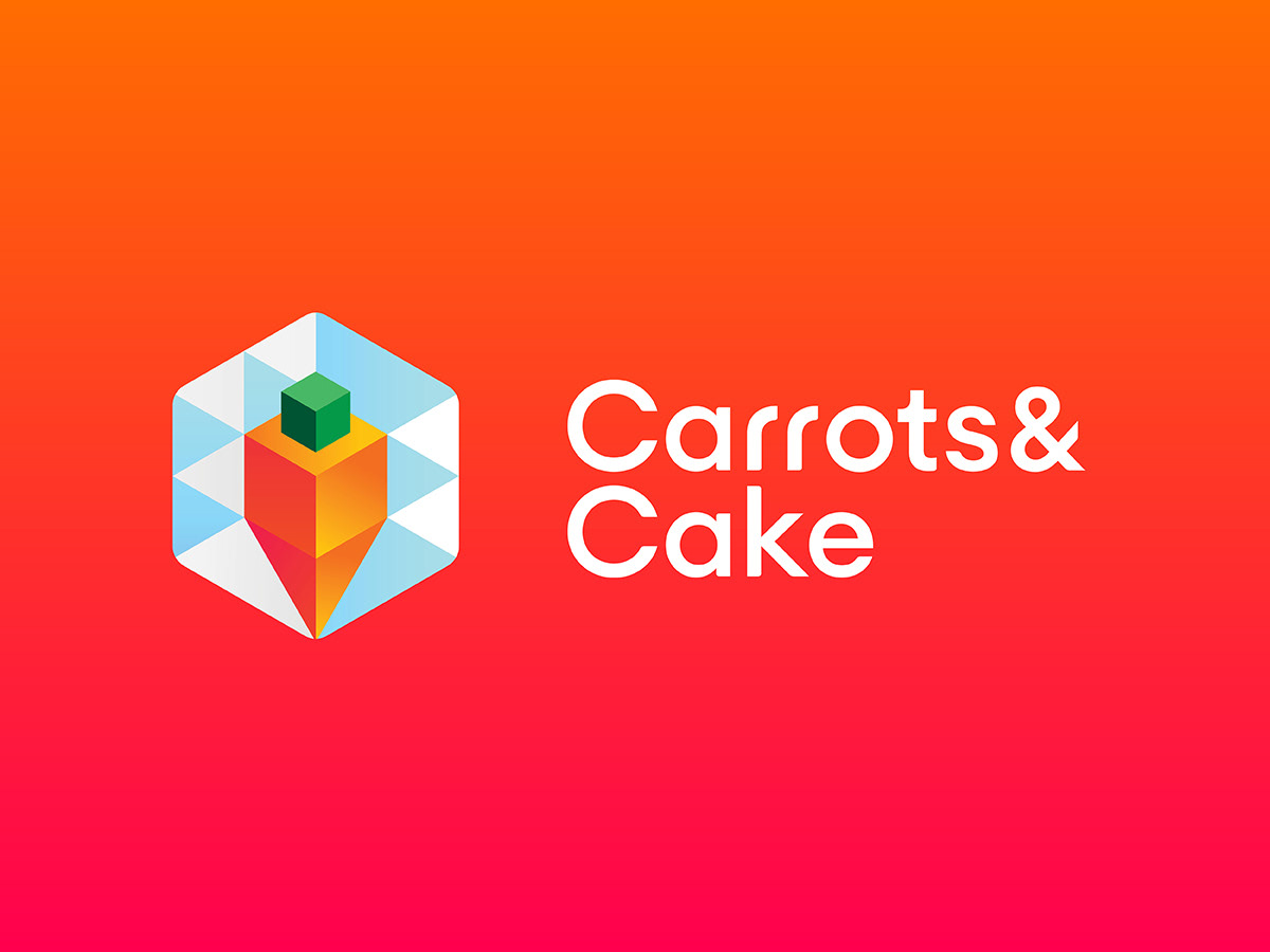
WISH&WORK designed a brand identity and key brand elements for an educational App service, Carrots&Cake.
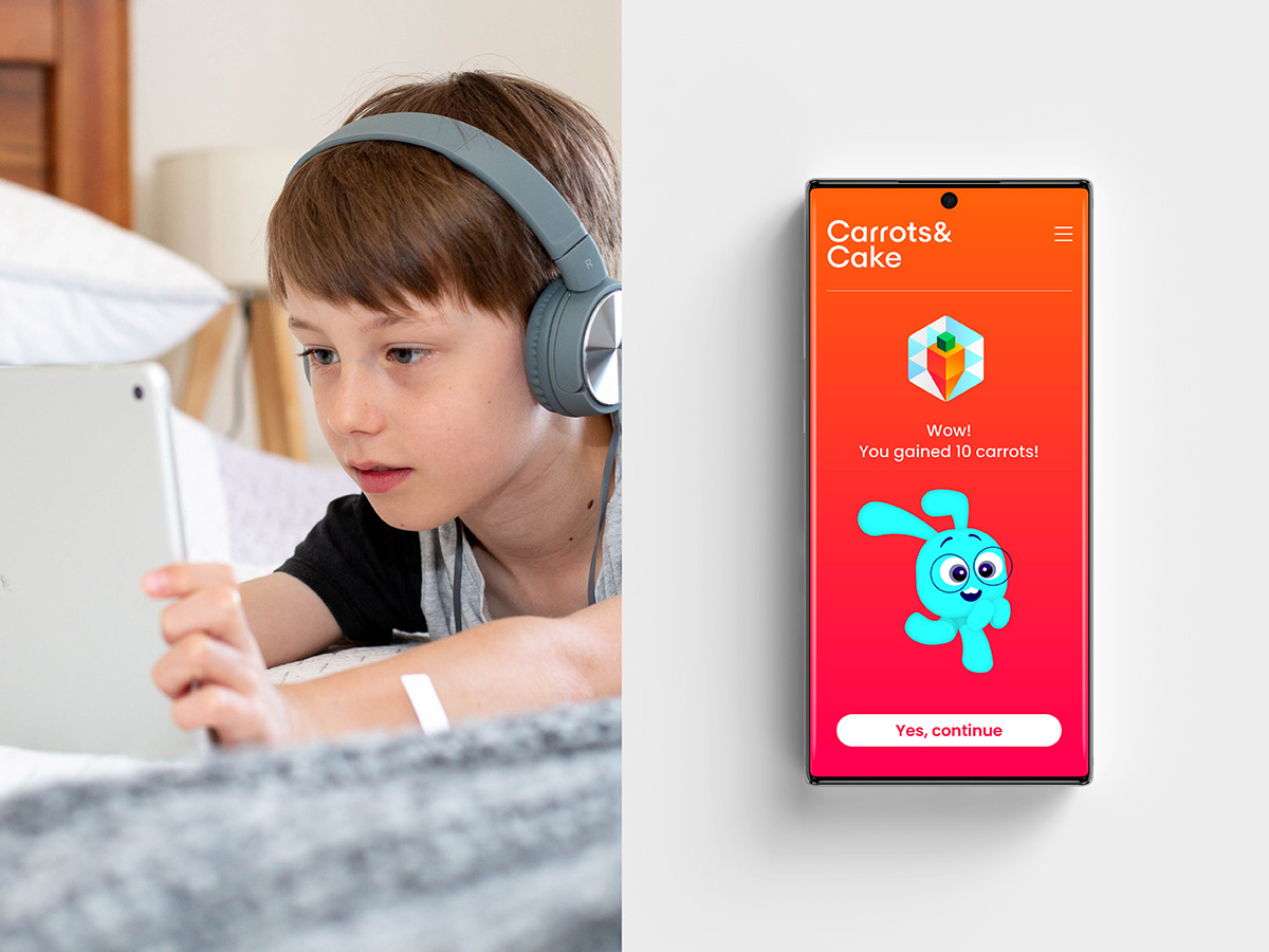
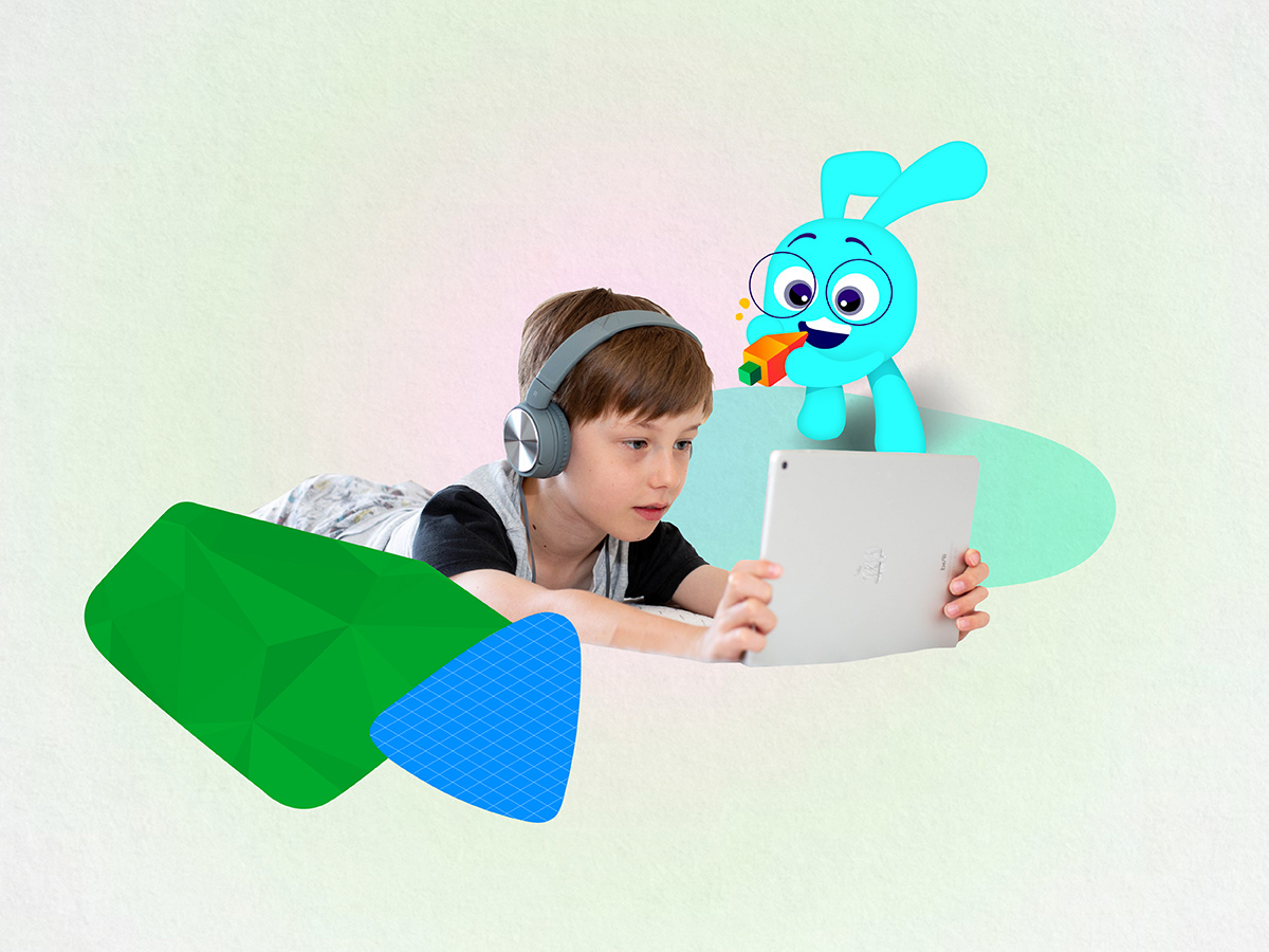
Carrots&Cake has been invented to wisely manage children's screen time. While we are all in a situation to handle the increased argument with our kids for screen-time, recently intensified by the pandemic, parents are faced with the challenge of managing their children's screen-time as well as improving the quality of it.
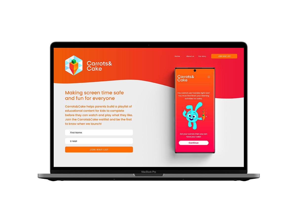
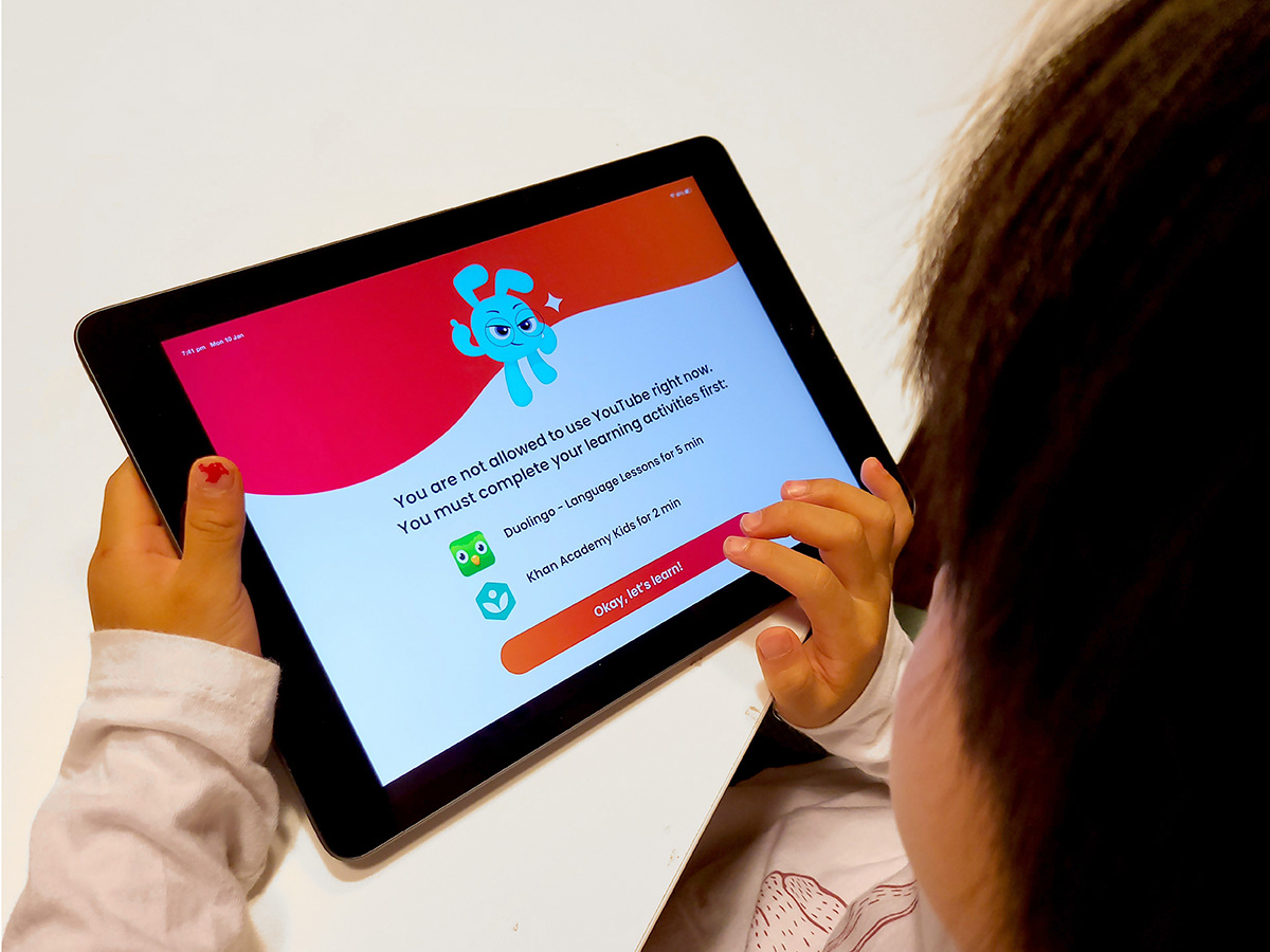
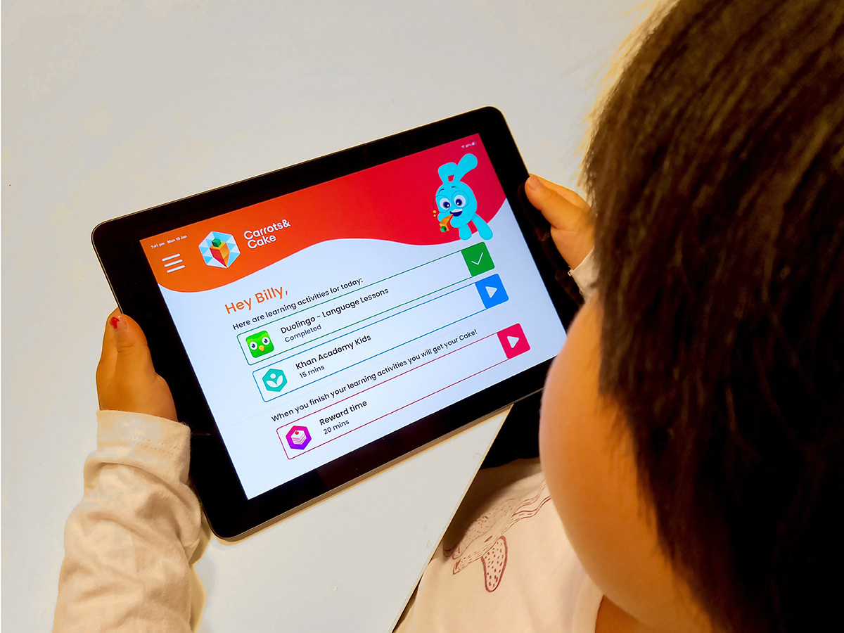
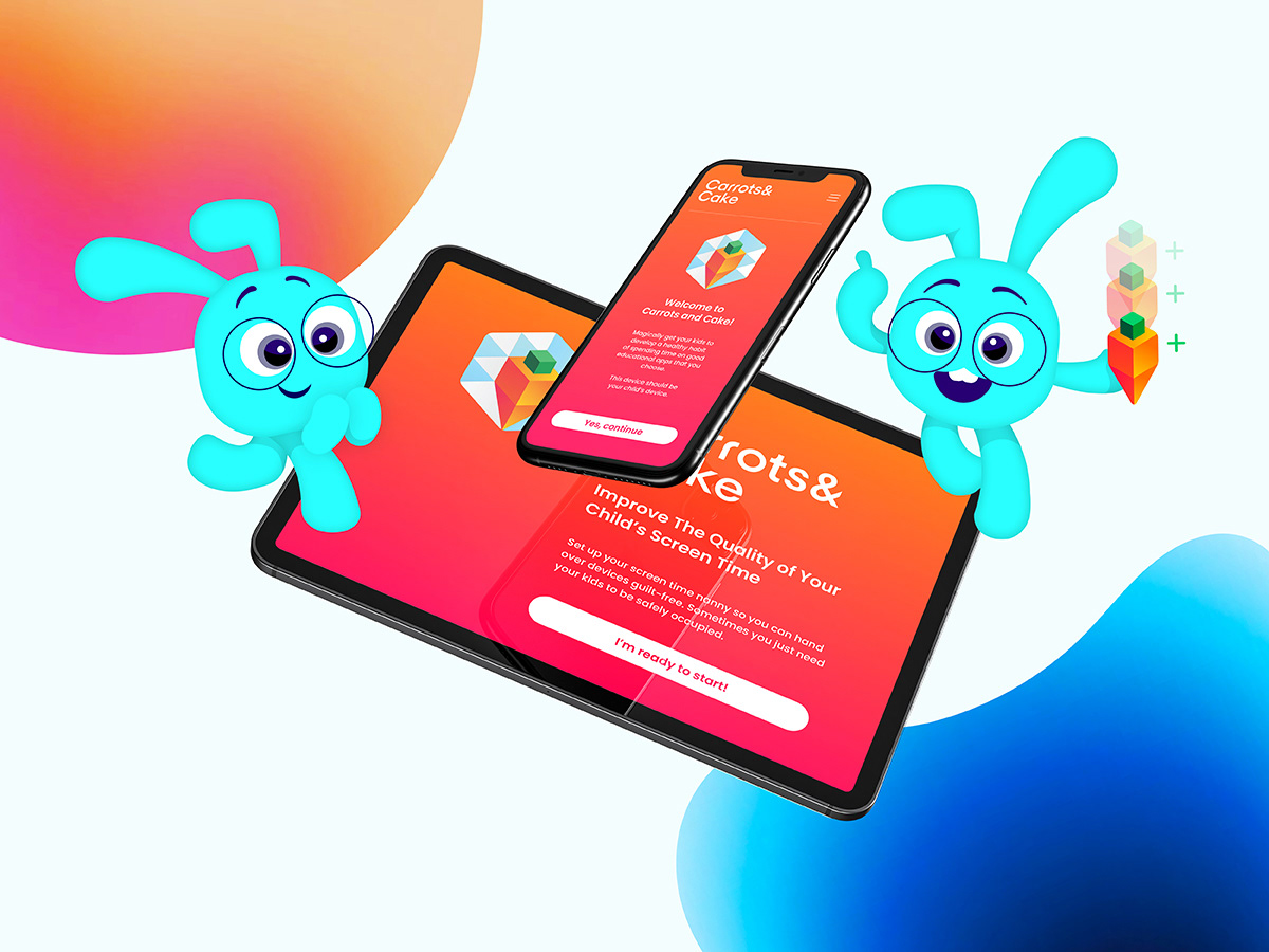
Carrots&Cake has been designed and offered as a smart tool for parents to oversee their children's use of educational apps/contents or the usage of other apps on iPads or smartphones. It brings a solution for parents who wants to set a daily target for kids, with the use of good educational apps rather than spending hours on YouTube and games.
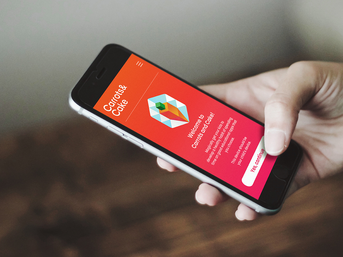
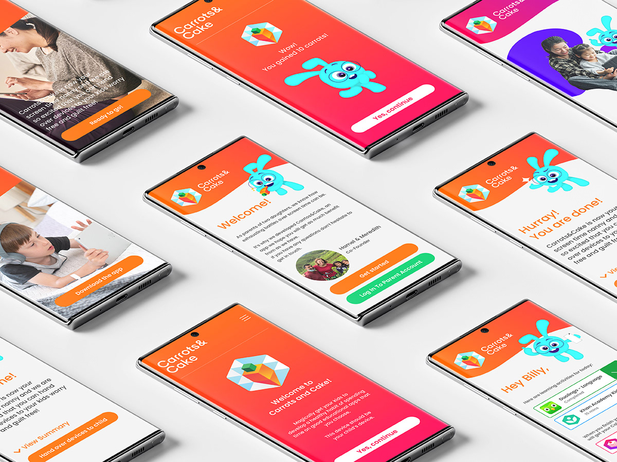
The range of work that is including brand identity and brand system are featured across various touch-points, strongly in user interface. The characters and illustrative elements are a huge part of the brand language, which makes the whole experience are playful and inviting for little children.
What was considered
To empower the user experience from the app, the client brief demonstrated the requirements for creative team as below;
- To create a brand identity that will appeal to the all age group, including parents and children
- To create characters, illustrations and other visual language to provide intriguing and cohesive user experience
- Brand name, brand identity elements, illustrations and the characters are designed to be all relevant each other
- Created elements should be inviting, positive, empowering, and engaging for the audience
The solution
The name of the brand, brandmark design, app icon, illustrative elements and character design are all considered to provide cohesive and seamless experience throughout the various touch-points including UX/UI as well as the website.
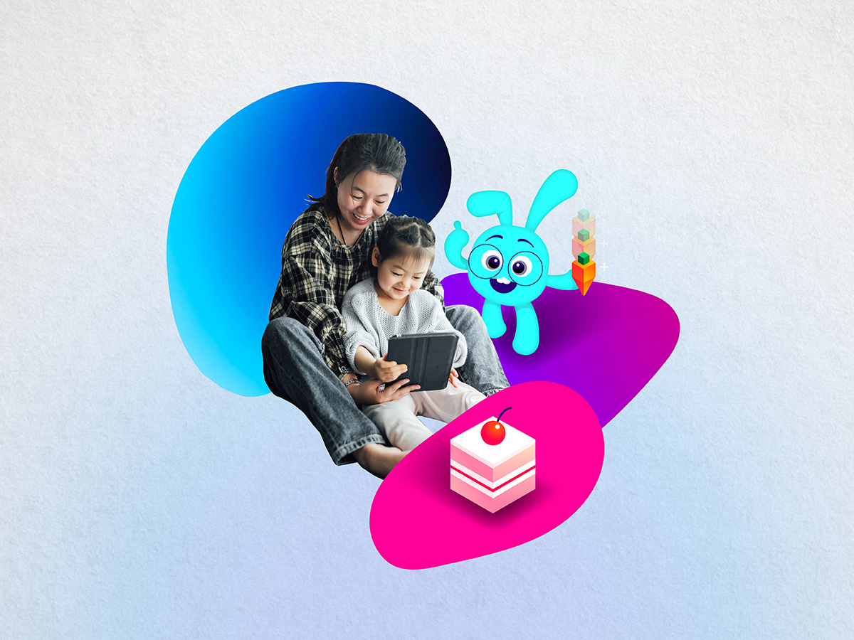
The screen-time limits back in control by Carrots&Cake are all about caring and family connection. Therefore, the design process for entire brand identity and the personality across other visual language were focusing on to represent connection, warmth, and positive energy.
The screen-time limits back in control by Carrots&Cake are all about caring and family connection. Therefore, the design process for entire brand identity and the personality across other visual language were focusing on to represent connection, warmth, and positive energy.
Considering our main audience, a single bunny has been chosen to represent the brand character and it's been designed with a variety of facial expression. Also with the use of our colours, typography, character, illustration, and photography are carefully curated to engage our little enthusiastic learners to have an educational outcome that is outstanding and superb.
https://carrotsandcake.com/
https://carrotsandcake.com/